Level 1 Reading charts · Part 7/7
What Technical Analysis Can and Cannot Do
The first level ends with the uncomfortable question: does any of this work? The honest answer has several parts – and it explains why the next two levels are built the way they are.
Three mechanisms that really do work
Self-reference. When enough participants watch the same level, orders really do build up there. The effect is real, but it does not scale. The better known a level is, the more attractive it becomes as a target for the other side.
Order mechanics. Stop orders cluster at visible prices. When they trigger, a short move follows. That move is not a change of opinion but forced execution. It explains false breakouts and fast moves after a break better than any catalog of patterns.
Behavioral patterns. Loss aversion, anchoring and herd behavior are well documented, and they produce price structures that come back again and again. What they do not give you is timing.
The best-supported result in all of this is not the pattern catalog but momentum: instruments that performed relatively strongly over the past six to twelve months tend to keep going for a few more months. The effect has been studied across decades and across markets – and it is nothing other than a trend statement in measurable form.
Four reasons why patterns look better than they are
The base rate is missing. “In seven out of ten cases a rally followed” only means something if you know how often a rally follows anyway. If stocks rise in 54 percent of all weeks, a pattern has to beat 54 percent by a clear margin before it carries any information.
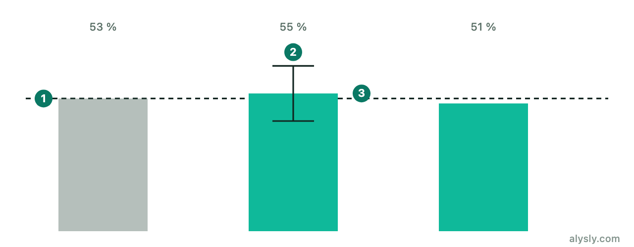
Selection bias in the examples. Textbooks show formations that worked. The ones that failed look identical until shortly before the end – and they never make it into the book. This is why every graphic in this course is synthetic: a real example would always be one that was picked afterwards.
Hindsight. In a finished chart every pattern is obvious. At the right edge, where you have to decide, they are candidates, and most of them will not work out.
Degrees of freedom. Timeframe, scale, indicator settings, the definition of a zone: with enough adjustable knobs, some combination always would have worked in the past. How quickly that search produces an apparently excellent result is the subject of Level 3 .
What follows from this
Charting is not worthless. But its contribution lies somewhere other than where it is usually claimed:
- It provides a shared language for price structure, and therefore descriptions you can compare.
- It provides testable levels. A pattern with a clear point of refutation is what makes risk management possible in the first place.
- It provides no forecast. If you want a statement about probability, you have to measure it – on a sample that is large enough, with a clean separation between training and test periods.
That is exactly the path this course takes. Level 2 describes patterns and indicators precisely enough to make them testable at all. Level 3 shows what goes wrong during testing, and how financial research deals with it.
To put an idea against historical data right away, start with the backtester and the return triangle – keeping in mind what Level 3 spells out: a single good backtest proves very little.
Next
That is the end of Level 1. Level 2 continues with candlestick patterns.