Return Triangle
The return triangle shows, for every combination of buy year and sell year, the annual return one of the four major US stock indices or gold would have delivered. It shows how much the outcome depended on the entry point and on the holding period.
How the Triangle Is Built
It uses the price series of the selected instrument. For each calendar year, the last price counts.
- Row is the buy year. The purchase happens at the previous year’s closing price, which is the start of the year.
- Column is the sell year. The sale happens at that year’s last price.
- Cell is the annualized return: (sale price ÷ purchase price)^(1 ÷ years) − 1.
The diagonal shows single calendar years. The further a cell sits to the right of the diagonal, the longer the holding period. Green stands for gains and red for losses. Colors reach full strength at ±20% a year.
An example of the formula: if an index rises from 100 to 150 points over five years, that is 50% in total and 8.4% a year.
How to Read the Triangle
Short holding periods on the diagonal vary widely, and single years can land in double digits up or down. The longer the holding period, the closer the values usually sit together, because good and bad years partly offset each other. That is an observation from each series’ past, not a rule for the future: some markets have stayed below an earlier peak for ten years or more.
The Monte Carlo simulation shows how widely a savings plan’s outcomes can spread when returns fluctuate at random.
Limits
- Price series without dividends. The stock indices run through futures. Dividends are not included, while financing costs are. The return of an ETF on the same index is therefore usually higher.
- Currency. The series are quoted in US dollars. For euro-based investors, exchange rate moves come on top.
- Lump sum. The triangle shows a single investment at the start of a year. A savings plan buys throughout the year and plays out differently. The article on savings plans vs lump sums explains the difference.
- Series length. The stock indices go back to 2017, gold to 2023. Because the purchase uses the previous year’s close, the triangle starts one year later. A few years yield only a few long holding periods.
- Costs and taxes are not deducted.
More calculators and tools are listed in the tools overview.
Latest Investment Analysis
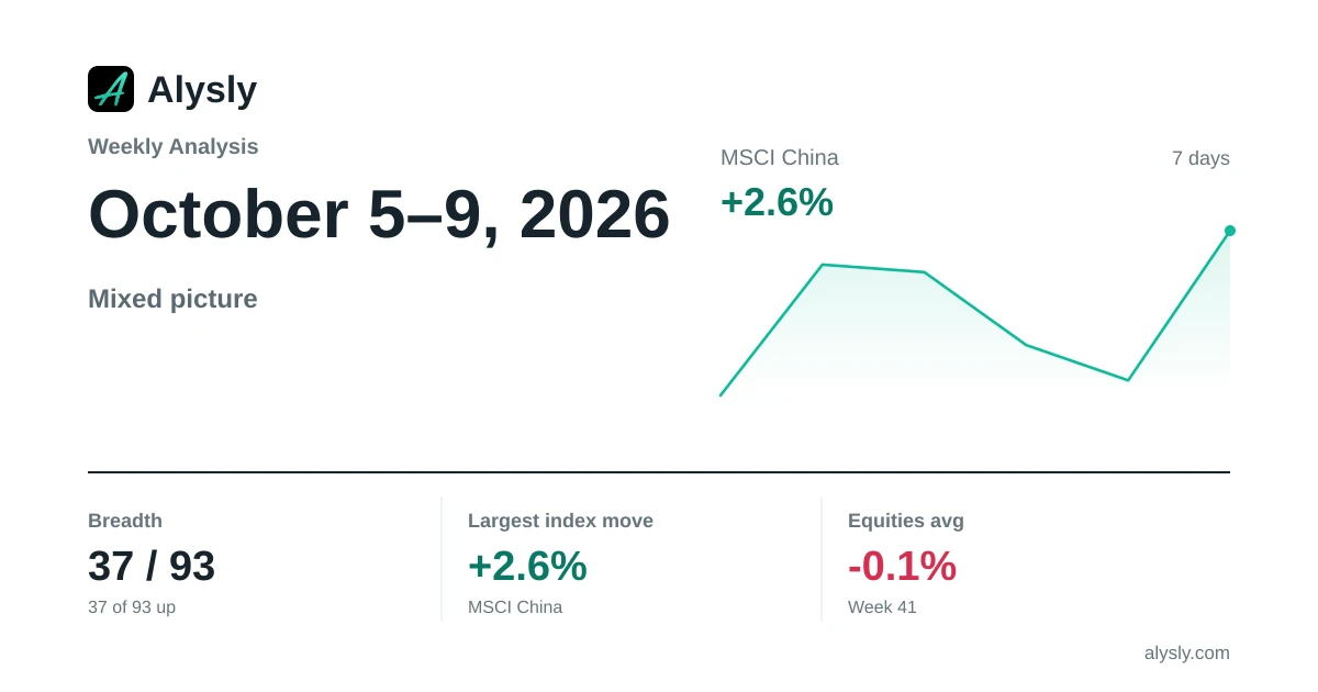 · Mixed
Weekly Analysis: MSCI China Leads the Week (+2.6%) · October 5–9, 2026
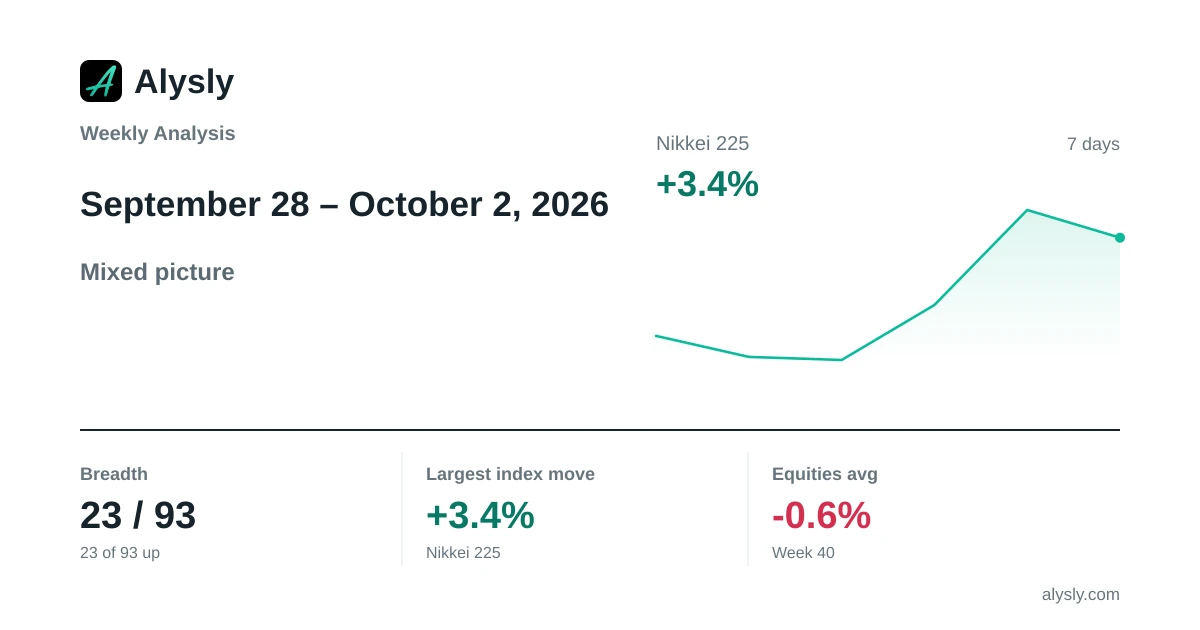 · Mixed
Weekly Analysis: Nikkei 225 Sets the Tone for the Week (+3.4%) · September 28 – October 2, 2026
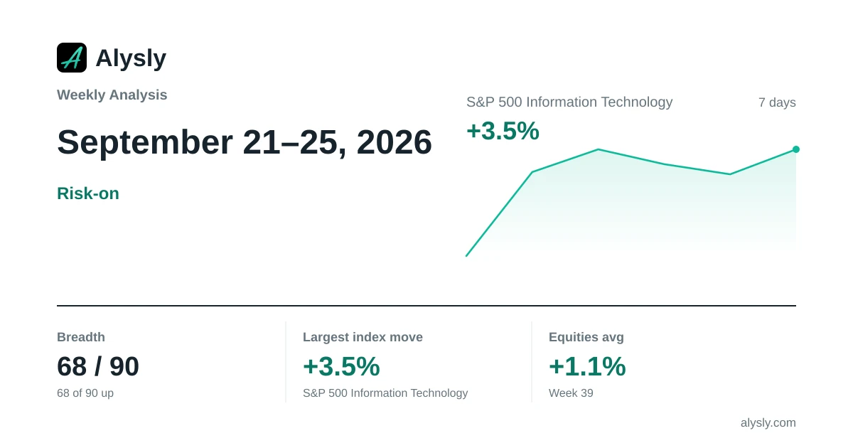 · Risk-on
Weekly Analysis: S&P 500 Information Technology Leads the Week (+3.5%) · September 21–25, 2026
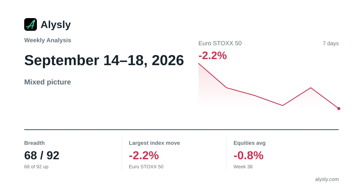 · Mixed
Weekly Analysis: Euro STOXX 50 Weighs on the Week (-2.2%) · September 14–18, 2026
 · Risk-off
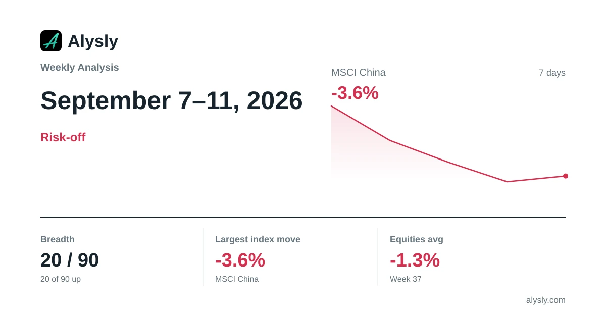
Weekly Analysis: MSCI China Lags the Week (-3.6%) · September 7–11, 2026