Level 2 Patterns & indicators · Part 4/9
Continuation Chart Patterns
Most of the time markets are not moving, they are waiting. Continuation formations describe that waiting – and the moment it ends.
They all rest on the same process: compression turns into expansion. The range gets narrower until it does not. The direction of the break that follows is far less predictable than the pattern names suggest.
Triangles
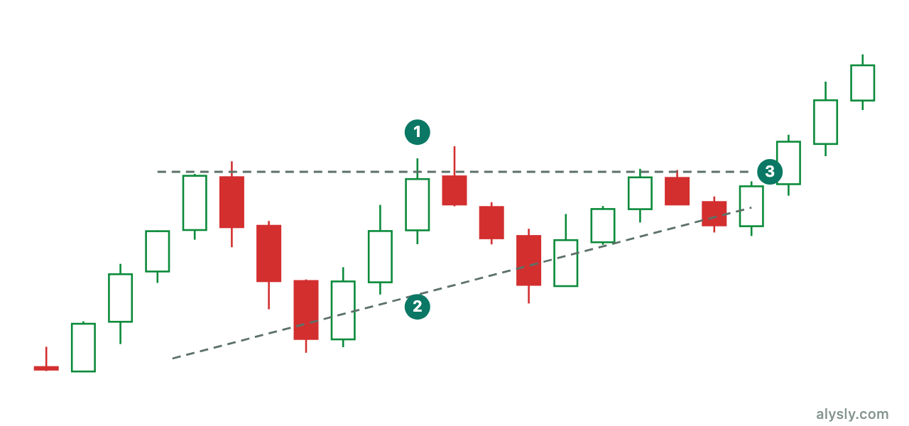
In an ascending triangle the highs stop at the same price again and again, while the lows keep rising. The reading: supply sits at the upper edge and is absorbed step by step, while buyers accept higher and higher prices.
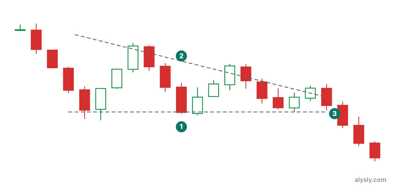
The descending triangle is the mirror image. When the horizontal support breaks, a fast move often follows, because the stop orders that built up there trigger extra selling.
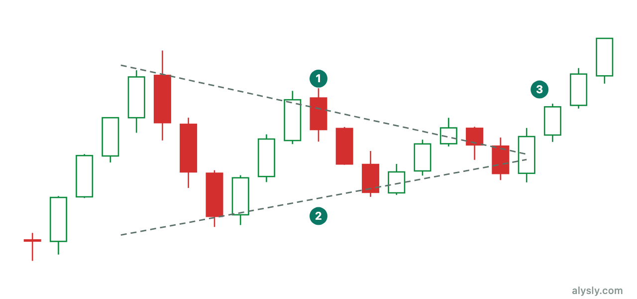
In a symmetrical triangle both boundaries move toward each other. It is the most honest of the three, because it suggests no direction at all: it says that something is contracting, nothing more.
One observation that matters in practice: breakouts in the last third of a triangle hold more often than breakouts close to the apex. If the price runs all the way into the apex, the formation usually dissolves instead of completing.
Flags and pennants
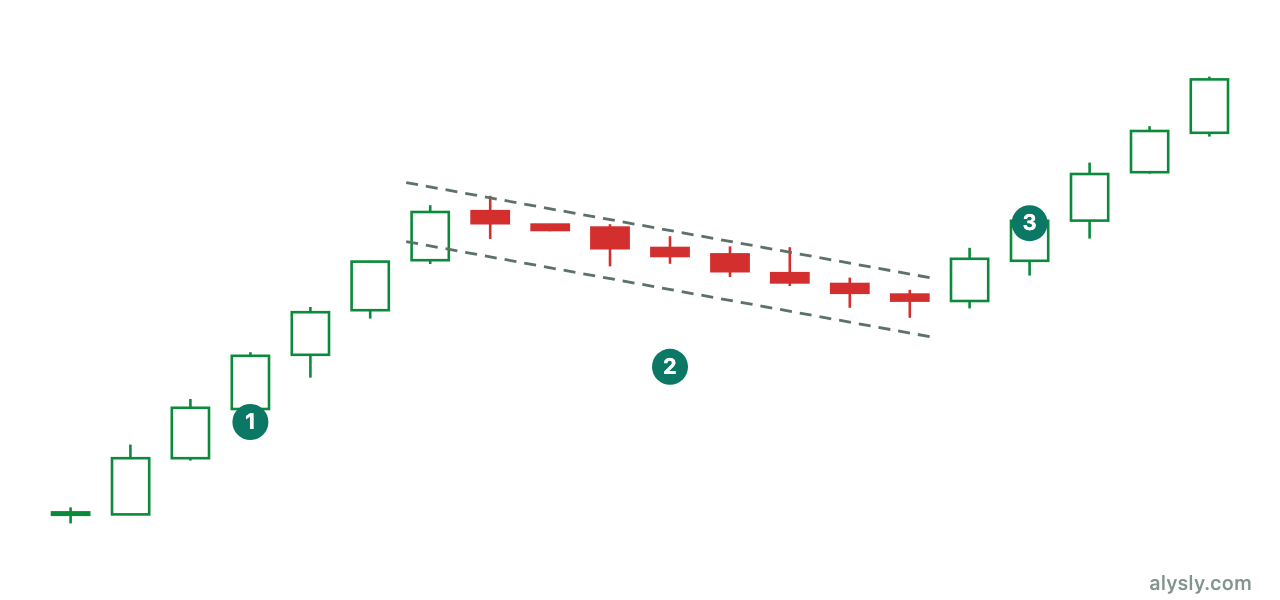
A flag consists of a steep move – the pole – and a narrow consolidation that slopes slightly against it. It is the pattern with the clearest argument behind it: profit-taking meets continued demand, and the move is not given back.
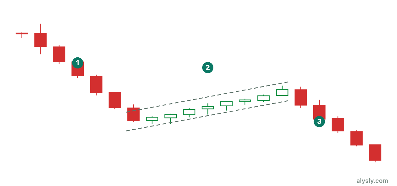
The downside version looks like a base but is not one. The difference is how far it goes: a bounce that recovers less than a third of the previous move is a pause; one that recovers half or more is no longer a flag.
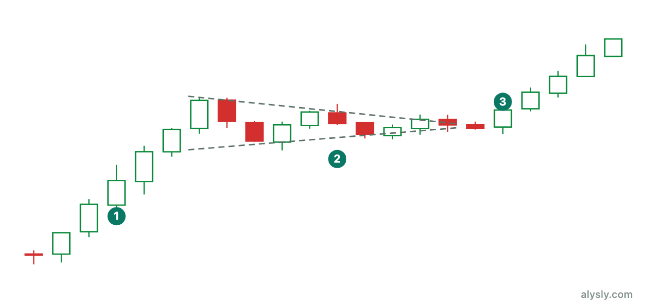
The pennant is the symmetrical version of a flag: no slope, but contraction from both sides. It usually lasts only a few periods. If the contraction drags on, you are looking at a triangle – and its link to the trend is much weaker.
Wedges
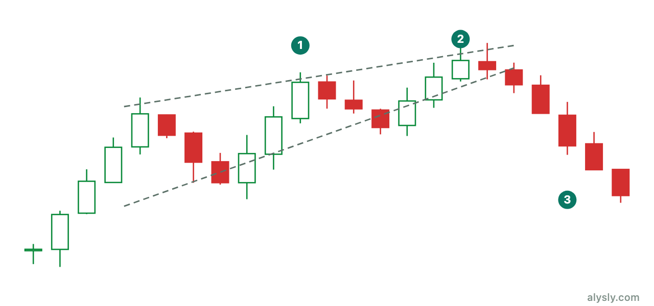
The rising wedge is the special case where rising prices signal weakness: both boundaries rise, the lower one more steeply, and each new wave is shorter than the last. The break is mostly to the downside.
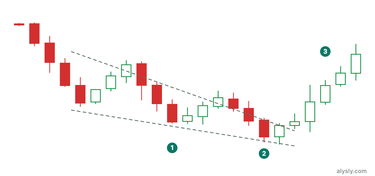
The falling wedge works the other way around. What makes both readable is not the direction of the lines but the shrinking amplitude – the same quantity a volatility indicator measures.
Rectangle
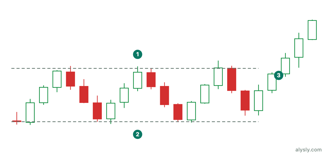
A horizontal range with several tests on both edges. The practical advantage: a failed breakout is obvious right away, because the price simply drops back inside. Of all the formations, the rectangle gives you the cleanest points of refutation.
Cup and handle
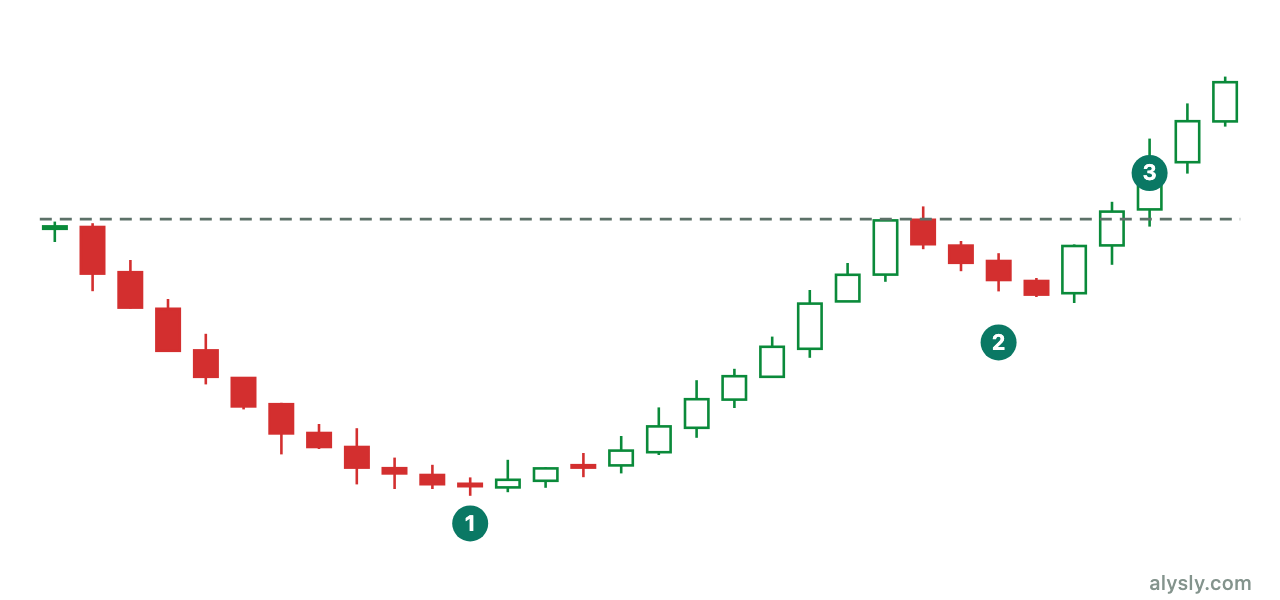
A rounded base followed by a short pullback just below the old high. The handle is where the last sellers get out. If it is deeper than roughly a third of the cup, the formation is void, because the recovery has been undone.
The warning they share
All of these formations have fuzzy definitions. How shallow may a flag slope? How many touches does a triangle need? Where exactly does the boundary sit?
Every one of those choices is a degree of freedom, and degrees of freedom are the raw material of overfitted results. If you want to test a pattern seriously, you first have to define it tightly enough that a program can find it without judgment. That is where most pattern statistics fall apart, long before probabilities come into play.
Next
From shapes to numbers: moving averages as the first indicator.