Level 1 Reading charts · Part 1/7
How to Read a Chart
A chart is not a picture of the market. It is a summary of it. Millions of single trades are reduced to a few numbers per period. Once you know which numbers survive that step and which ones disappear, you read the same chart differently.
Four numbers per period
Almost every price chart is built on four values per period: open, high, low and close, or OHLC for short. A period can be one minute, one day or one month. The four values stay the same.
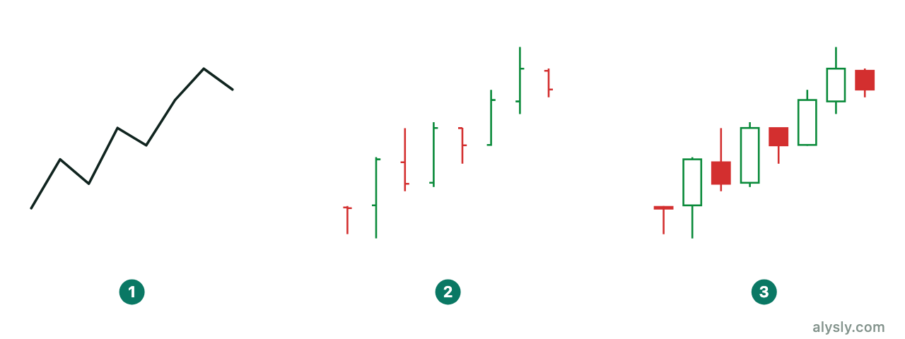
The line chart shows closing prices only. That is less information, but not automatically worse. The close is the price the market agreed on at the end of the period, so short spikes that nobody wanted to hold drop out. For a view across several years, the line is usually the calmer picture.
The bar chart adds the high, the low and the open. The candlestick chart shows the same four values, but it fills the space between open and close. That makes the direction of the period visible at a glance. Bars and candles hold exactly the same information; the candle is only quicker to read.
The timeframe is part of the answer
The same market looks different in different timeframes, and none of them is the “correct” one. A drop that looks like a broken trend on the hourly chart can be a single candle with a long lower wick on the weekly chart.
In practice, the timeframe has to match how long you plan to hold. Someone who holds for months does not decide on a 5-minute chart, because at that level most of what they see is noise. A weekly chart, on the other hand, cannot resolve a move that starts and ends within two days.
The common solution is to combine two timeframes: a higher one for direction and structure, a lower one for timing. Three or more rarely add clarity, but they reliably add contradictions.
Linear and logarithmic scales
On a linear scale, the same distance always means the same amount of money: 10 to 20 covers the same distance as 100 to 110. On a logarithmic scale, the same distance means the same percentage change, so 10 to 20 is as far as 100 to 200.
For investors, the logarithmic scale is almost always the right choice, because the percentage change is what matters, not the absolute amount. Over several years the difference is dramatic. Drawn linearly, every multiplication looks like an explosion at the right edge, while the early years flatten into a straight line. Trendlines also end up in completely different places depending on the scale. That is one reason why two people can argue about the same “broken trend”.
Adjusted prices
A price chart often does not show the price that actually traded. Splits and dividends are calculated back into the older data so that the series stays continuous. Without this adjustment, every split would create an artificial gap, and every dividend an artificial drop on the ex-date.
The adjustment is the right choice, but it has consequences. Old prices in an adjusted chart match no price that was ever tradable. If you draw support “at 50 from 2018”, you are using a number that never existed on the exchange. Commodity futures add a second problem: contracts expire and have to be rolled. Without a correction, this also creates jumps that were never a market event.
What a chart leaves out
- The order of events inside the period. A daily candle does not tell you whether the high or the low came first. Two completely different trading days can produce identical candles.
- Whether you could trade there. A price on the chart does not mean that a meaningful amount could have traded at that price. In thin instruments the gap between bid and ask is wide, and the drawn price sits somewhere in between.
- The reason. A chart shows the result, never the cause. This is why price data and the economic calendar work well together: one shows that something happened, the other often shows why.
Next
The next article takes the candle apart and explains why the ratio of body to wick says more than the color does. To see the real price series of each market, start with the markets overview .